Colour Management for Photographers 2
This is the second instalment of a series on colour management. The index of the sections is shown below, and the links to all completed section are active.
Section One – Why Colour Manage
- Part One – In the context of the world we live in
- Part Two – Why is our workflow important? (below)
Section Two – All About Colour Spaces (coming soon)
Section Three - Capture, Display and Working Management (coming soon)
Section Four – Output Management (coming soon)
Section One – Why Colour Manage? Contd…
Part Two – Why is our workflow important?
So from the first part of this section, we should now roughly see why it is necessary to colour manage at all. This second part will discuss why it is necessary to include colour management in our photography workflow. In an ideal world, once we have taken care of the lighting and colour of our subjects at the shoot, our concerns over colour accuracy would stop there. Unfortunately reality is far from that ideal, and we need to discuss a little bit why there is a need to colour manage through each step of our workflow.
I really want to keep these articles down to a bare minimum of information, and it is quite tricky to do so, as the subject is huge and complex. I think it is important to include enough information to really understand what is going on with colour management rather than just having people repeat parrot fashion and not really understand why it is they are doing it. This limits your ability to adapt when and if things go wrong and decreases your confidence of using it. The simplest way I can think of to demonstrate why our workflow needs colour management is to use an example of where things can go wrong if it is not used.
I really want to keep these articles down to a bare minimum of information, and it is quite tricky to do so, as the subject is huge and complex. I think it is important to include enough information to really understand what is going on with colour management rather than just having people repeat parrot fashion and not really understand why it is they are doing it. This limits your ability to adapt when and if things go wrong and decreases your confidence of using it. The simplest way I can think of to demonstrate why our workflow needs colour management is to use an example of where things can go wrong if it is not used.
A Prime Example of Lacking Colour Management
Our example is going to take a person that either is not aware of colour management or decides not to use it. This person has recently gone out and bought a top-of-the-range dSLR and all singing and dancing photo inkjet printer. Obviously being quite interested in photography they choose to shoot RAW and import their RAW images into a raw converter. The first thing they decide to do is set white balance (a good place to start). Along with probably the majority of people, they set their colour balance by eye-balling the image. They adjust the sliders around to get the colour in the shot to look pretty damn close to how they remember the scene looking. Happy that the WB is set correctly they move on to completing their edits, maybe a little playing with saturation, setting the overall exposure and the black& white points. At this point they have the image spot on and are ready to get there super new printer to spit out a nice 18” print. The printer does it stuff and they go to make a cup of tea. A few moments later they come back and the print is finished, so they pull it off and hold it up to the light. They then stagger two paces backwards as the printer has products the most disgusting distortion of colour and shades possible. Everyone in the photo looks like they have applied copious amounts of Duotan and the sky is green. Their first and natural reaction is to be rather disappointed with the printer they just shelled out so much money for. In fact I read that the majority of complaints that printer manufacturers receive is from just such cases.
The fact that they blame the printer is understandable, their logic being that the state of the art camera surely is doing its job – they have seen wonderful images from other people with that exact same camera - so they assume the issue must lie with the printer. A certain degree of the problem may lie with the printer – but in most cases it isn’t the printer at issue. All through the process they assumed their monitor was showing them the correct colour.
 Now let’s adapt the situation slightly. Say they shot the same image in JPG in the camera. They did not touch the photo in any software, just sent it to print. In all likelihood the image would print pretty well, certainly a lot better. Hmmm.
The facts here are that by and large the camera manufacturers turn out pretty accurate capturing devices, so they record the scene pretty well. In turn the printer manufacturers, certainly in the case of printers marketed for photo printing, turn out fair accuracy on their printers. The result is sending one directly to the other results in a pretty close colour match. What most people fail to consider is that when they view the image from the camera on their screen they are seeing the original file how the screen decides to show it. Most people do not go and buy “photo” monitors – for one thing they are expensive and seem unnecessary (usually they are unnecessary), they are quite happy with their screens and don’t give it much thought. A big mistake. Monitor manufactures are not really in the limelight when it comes to colour accuracy. That is because most people don’t really care that much, as long as it is in the right ball park you are good to go. You probably should expect reasonable accuracy though, and *may* even have it, but way back when you first got your monitor maybe you forgot that you played a little with the controls to get the brightness etc. Just how you like it…. The result being that the image may have been spot on in the first place, it just looked rubbish on your screen, so you adjust it to look right on your screen; in turn make the actual file rubbish!
Of course there are many many reasons why a monitor may fail to show good colour accuracy. Up till now we have only spoken of monitors, but the fact is that to lesser or greater degrees all devices will suffer some inconsistencies that effect accuracy. You might be sitting there saying, “Well I paid a lot of money for my monitor, and I never touched the controls, so it should still be spot on”. Well you can think that if you like, but look through some examples below of why any device may cause colour inconsistencies and inaccuracies.
The fact that they blame the printer is understandable, their logic being that the state of the art camera surely is doing its job – they have seen wonderful images from other people with that exact same camera - so they assume the issue must lie with the printer. A certain degree of the problem may lie with the printer – but in most cases it isn’t the printer at issue. All through the process they assumed their monitor was showing them the correct colour.
 Now let’s adapt the situation slightly. Say they shot the same image in JPG in the camera. They did not touch the photo in any software, just sent it to print. In all likelihood the image would print pretty well, certainly a lot better. Hmmm.
The facts here are that by and large the camera manufacturers turn out pretty accurate capturing devices, so they record the scene pretty well. In turn the printer manufacturers, certainly in the case of printers marketed for photo printing, turn out fair accuracy on their printers. The result is sending one directly to the other results in a pretty close colour match. What most people fail to consider is that when they view the image from the camera on their screen they are seeing the original file how the screen decides to show it. Most people do not go and buy “photo” monitors – for one thing they are expensive and seem unnecessary (usually they are unnecessary), they are quite happy with their screens and don’t give it much thought. A big mistake. Monitor manufactures are not really in the limelight when it comes to colour accuracy. That is because most people don’t really care that much, as long as it is in the right ball park you are good to go. You probably should expect reasonable accuracy though, and *may* even have it, but way back when you first got your monitor maybe you forgot that you played a little with the controls to get the brightness etc. Just how you like it…. The result being that the image may have been spot on in the first place, it just looked rubbish on your screen, so you adjust it to look right on your screen; in turn make the actual file rubbish!
Of course there are many many reasons why a monitor may fail to show good colour accuracy. Up till now we have only spoken of monitors, but the fact is that to lesser or greater degrees all devices will suffer some inconsistencies that effect accuracy. You might be sitting there saying, “Well I paid a lot of money for my monitor, and I never touched the controls, so it should still be spot on”. Well you can think that if you like, but look through some examples below of why any device may cause colour inconsistencies and inaccuracies.
Manufacturing Process
Every device you buy is mostly likely a combination of many components coming from various manufacturers. Perfection in electrical components is neither achievable nor practical. Therefore components have a tolerance value, a level in inaccuracy they are permitted to fall within in order to be deemed acceptable. So even if your buddy down the road has the exact same monitor, and all the controls are set exactly the same as yours, it is likely that the colour it displays is slightly different. There is of course even more disparity if he owns a different model, and even more of from a different manufacturer. If they are using different components, and maybe even different technologies you are really expecting a lot for them to produce nearly identical results. Of course, I keep using monitors as an example (as it is the most common error, and also the easiest to fix – as we shall see in future instalments), but the same applies, and probably in many cases even more, to all devices.
Natural Degradation
As with all things, devices age, and with that aging process changes to their output occurs. So even if your device was truly accurate a year ago, the likelihood is that the components responsible for the imaging are now producing different results. This fact is true even once you take on boards colour management techniques, and requires that you continually carry out steps to remain in a good colour managed workflow.
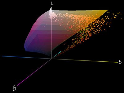 fig.2 - Although getting ahead of the game a bit, and in the next instalment we shall talk more about colour spaces, this shows the gamut (available colour palette) on the Epson 1290 inkjet printer (custom profile by nimby) as the solid shaded area. This is a 3D representation, and you are seeing only one side here (magentas and yellows). The concept is that the 1290 can produce all the colours that are inside this shaded area, but cannot produce any colours outside the shaded area. The dots sprinkled around are a representation of all the colours that make up the photo at the top of this page. As you can clearly see a large number of these dots (colours) fall outside the shaded area (gamut) of the 1290 printer. That is to say that the 1290 printer CANNOT print those colours....(graphic copyright of nimby)
Inability
Up till now we have just assumed that our device is actually capable of producing the required colour. Actually in reality this is a long way from the truth and is a huge reason for the need to colour manage. In the next instalment we shall discuss this in more depth, but for now it can just be said that NO monitor can produce all the shades and tonalities that a camera can capture, and neither can any printer. Further, NO device can fully encompass the human eye’s range of colour. Fig.2, above, demonstrates a prime example where a device's colour capabilities prevent it from reproducing the true colours as they were in the scene.
Methods of Visibility
This is a tricky subject. It is huge and complex, but I will attempt to summarise it in quite a few sentences. It can be said that the human eye receives colour from two methods of source. The first is transmitted light, a good example of that is the monitor you are looking at now. It is its own light source, and that is why you can see it in a dark room! The method by which you see colour from your monitor is that the monitor transmits light to your eye in colours that your eye is sensitive to, as shown in fig.3, below. To give a simple example to demonstrate, let’s say you have a photo of a pure green apple, lit with white light on your screen. Your screen will transmit green light and the eye, being sensitive to green (along with red and blue) sees the apple as green. All good.
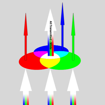 fig.3 - A graphical representation showing the concept of transmitted (a.k.a emitted) light's ability to give colour. A simple real life example would be red, green and blue coloured glass. When white light (a mixture of red, green and blue light) is shone through the coloured glass only parts of the spectrum pass through, the others are absorbed. In the case of red, as shown above, the green and blue parts of the spectrum are absorbed, leaving only red passing through - so we see the colour of the glass as red. Naturally, if we were to mix red and blue to make a magenta coloured glass, this would allow both red and blue to pass through, giving a magenta light (this is adding colour - an additive process). If we mix all three, red, green and blue to make the glass, it would allow all of the light to pass through and we would see white. (graphic copyright of nimby)
There is however another method of visibility and that is reflected light, see fig.4, below. Anything which is not its own light source relies on reflected light for you to see it. (There are of course overlaps, but let’s keep it simple.) Let us take that same green apple as it would have been before we photographed it. It was sitting on a table being lit with white light. It does not produce its own light therefore it must reflect some of the light being shone on it for you to see it. The reason it appears green to the eye is that it does not reflect all of the white light shining on it. In this case it absorbs all of the red and blue parts of the white light, leaving only green which it reflects and hence you see it as green.
You might be wondering what this has to do with colour management. Well consider for a moment that if you ever print any of your photographs, you are changing their method of visibility from transmitted (what you saw on your screen) to reflected. The print is not its own light source (unless back lit….) and so must rely on reflecting the light it is being viewed under. Of course these are very different techniques by which we see, so differences between them are all too easy.
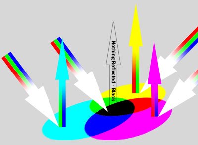 fig.4 - A graphical representation showing the concept of reflected light's ability to give colour. Where the object does not possess its own light source it relies upon reflecting light to be seen. As shown in this graphic a cyan coloured object, when lit with white light (a combination of red, green and blue) , will absorb all of the red in the white light, reflecting only green and blue, which, when mixed, give cyan. The other main difference between this and transmitted light, as shown in fig.2, is that it is a subtractive process. If we were to make an object blue in colour it would be a mixture of cyan and magenta. The cyan would absorb the red from the white light, the magenta would absorb the green; leaving only blue being reflected. It is only a small step from there to add yellow into our object to remove the blue and our object would absorb red, green and blue and so reflect no light. That would make it appear black. (graphic copyright of nimby)
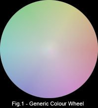
The last thing I need to say about reflected and transmitted light is specifically related to prints. It is a major factor in why we can get differences between screen and print. It is just a closer examination of the difference between the two methods of visibility, but is especially important to understand. If we consider that transmitted light is a mixture of red, green and blue (which visible light is – as of course is your monitor), and that if we mix all of the together to their maximum values we get white (as discussed in part one section one) then how does this work for a print? After all the paper is white already, so if we then mix red, green and blue on it we just get lighter colours! Enter cyan, magenta and yellow, or CMY. What is clear is that a white piece of paper, before printing on, is reflecting all parts of the spectrum (RGB), hence it appears white. What we really want to do, as in nature, is to remove parts of that white light and reflect the remaining parts of the spectrum – hence giving colour. It is by no co-incidence that if you look on a colour wheel, as in fig.1, you will see that cyan is around the opposite side to red. Ditto magenta to green, yellow to blue. What this means is that cyan absorbs ALL red light, magenta absorbs ALL green light and yellow absorbs ALL blue light. Now we have a method to control which parts of the visible light spectrum are reflected, and hence we can cause any combination of RGB to be reflected by CMY. Simple eh? The CMY process is what is known as a subtractive process (RGB is an additive process), because as we have seen it removes parts from the visible light – therefore if you mix CMY together you remove red, green and blue from the spectrum. Which leaves you with…. nothing. As visible light is made up from a mix of RGB, if you remove all the RGB you are left with no light or black as we like to call it. So in theory to get black on your print you mix cyan, magenta and yellow together. In reality it doesn’t quite work out like this (surprise!), as it really isn’t possible to get inks so pure that when CMY are mixed it reflects nothing. Usually it looks kind of muddy brown. To get around this we add a real black ink to the mix, which by itself absorbs all light and appears black. This gives us the CMYK printing process which is the basis for just about all colour printing in existence. (K as in blacK, B is already used for blue).
Summary
So these are just a few examples of why different devices see colour in varying ways, and of course there are many more which I wont detail such as temperature, viewing angle, light conditions; the list goes on. The important thing to understand that without some intervention all devices, even if basically using the same principles, will display the *same* colour differently. This puts you in a position where you don’t know if what you are seeing on your screen is really what the printer will print, or even if it is the same as the camera saw. This is not a good situation to be in if you are interested in high quality output.
In the next instalment I shall discuss the methods by which we bring this all under control, the actual activity of colour management.
In the next instalment I shall discuss the methods by which we bring this all under control, the actual activity of colour management.

